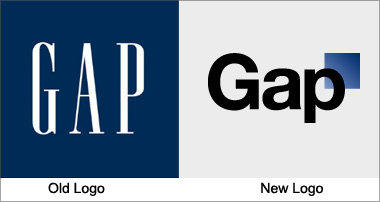
I was up late last night, mostly working on a database issue (boring) but I took a break to read the BBC news site and I found a story I found hard to believe. Gap customers worldwide were complaining about the new logo the brand adopted (see BBC source). I had recently changed the logo for Gap Canada on our site (if you see the homepage you will see what I mean, but it wont be there for long) and I have to say that we all here liked the logo, it was simple, unique, rememberable and did the job, I am a big fan of clean logo’s and this is one of them.
So here are the two controversial logos. The one on the left is the old one, the one on the right is the new one which people got in a huff about.

Not long after the world-wide brand changed their logo on their site as well as in a few other places, subscribers to the Gap Facebook page started complaining that they didn’t like it and wanted the brand to change their logo back to the original one that they knew and loved. After much hubbub and hype (I mean a simple logo issue was on the front page of the BBC as well as on the National Post here in Canada) Gap decided to go back to their old logo, saying;
“Ok. We’ve heard loud and clear that you don’t like the new logo. We’ve learned a lot from the feedback. We only want what’s best for the brand and our customers. So instead of crowd sourcing, we’re bringing back the Blue Box tonight”
And within minutes, over 2,000 of their subscribers ‘liked’ this comment. In total there were over 4,000 comments on separate but related logo wall posts on the Gap facebook page, making this issue one of the most talked about in a while.
But what we don’t get is why. What is wrong with change? We think the new logo is better in a lot of ways and while we are all a little nostalgic sometimes and we believe in history and heritage why can’t a brand bring a new logo to market? Most brands change their logo slightly every 7 years, even more so in the early years. Make a comment below to discuss.
